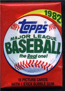
1982 Topps Baseball
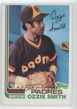
Design: Its a very simple design not much going on which I like.The side of the card has stripes of the colors which makes the card stand out. The all-star cards look amazing with the stars on the side which they should of done to all the cards. The signatures look nice on the card reminds me of current Bowman.
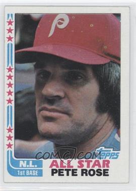
Color Scheme: Many teams have bad color combinations which are awful.
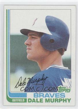
Like this card of Dale Murphy, they used light blue and green for a braves player. Many cards use that same green, there are not that many colors that they use. The only color scheme that looks good is the red/blue.More variety of colors would have made this product look nicer.
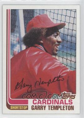
Photography: There some great photos some bad in the set. Many photos are taken from a side which make the card unimpressive.
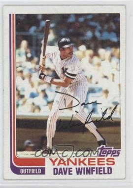
But there are some great photos,most of them while batting. Here's an amazing photo of Dave Winfield getting ready to hit.

Steve Carlton looks like he has no hand its soooo funny.


0 comments:
Post a Comment